From a filter to a place
Giving four kinds of digital account their own identity, and letting the product act on all of them.
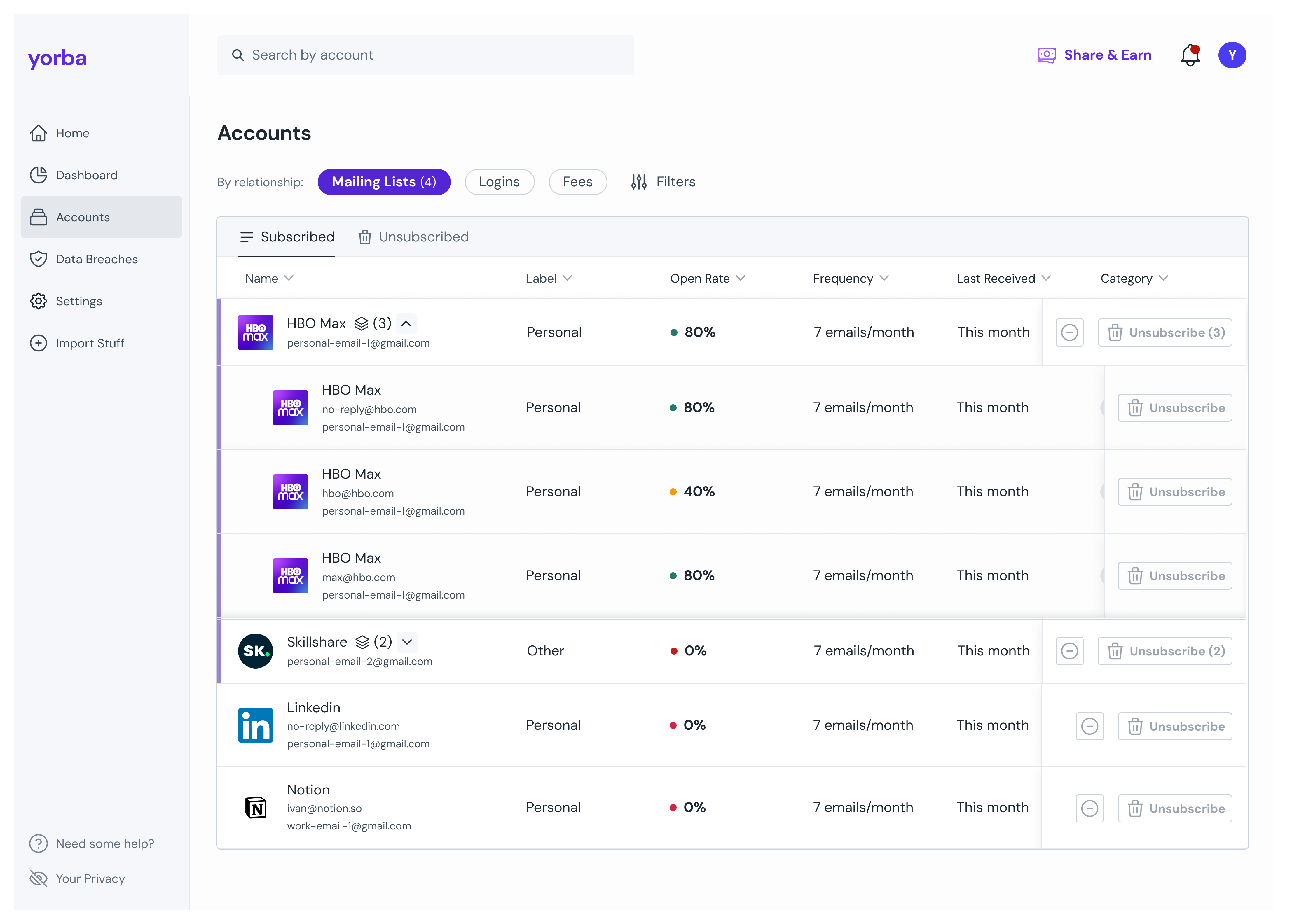
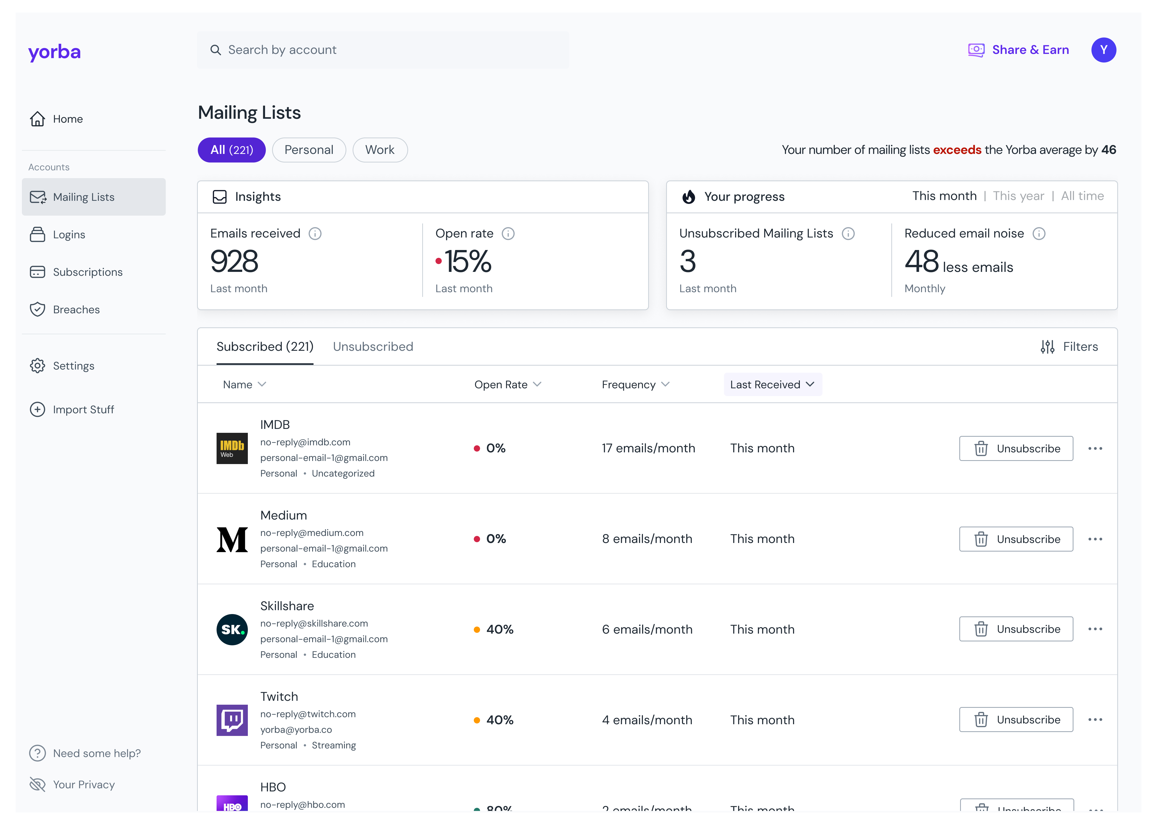
A consumer privacy product. Yorba scans your email and banking connections, finds the companies you are entangled with, and helps you cut the ties you no longer want.
Four kinds of account: mailing lists, logins, subscriptions, breaches. Three were filter states on one table and the fourth sat on a page of its own. People acted on the wrong thing, then contacted support to ask why nothing had changed.
Decisions
Four relationships, four destinations, each with its own measures, columns and voice. One company appears in as many as apply, because the duplication is what teaches the model.
Results
Gated release, so one before/after window, and the new stats shipped at the same time, which means the movement is the whole revamp.
Splitting one company across four pages was the argument I expected to lose.
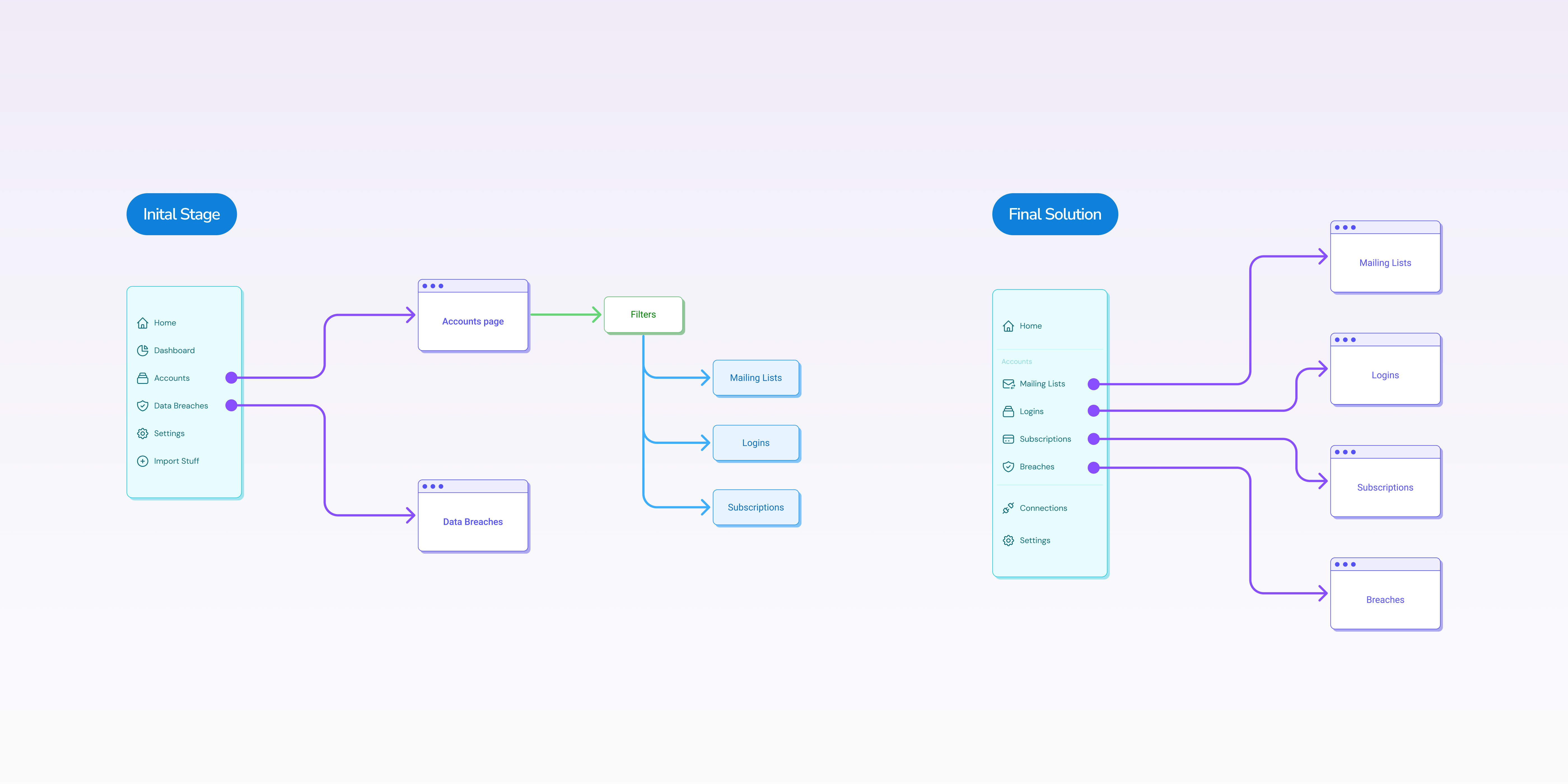
Four relationships, three in a filter and one elsewhere
Yorba helps people see their digital footprint and reduce it: the mailing lists filling their inbox, the logins they have forgotten, the subscriptions still charging them, the breaches exposing their data.
Four very different relationships with a company. The product treated three of them as filter states on a single list, and kept the fourth on a separate page in a format of its own.
A relationship was a filter state, not a place
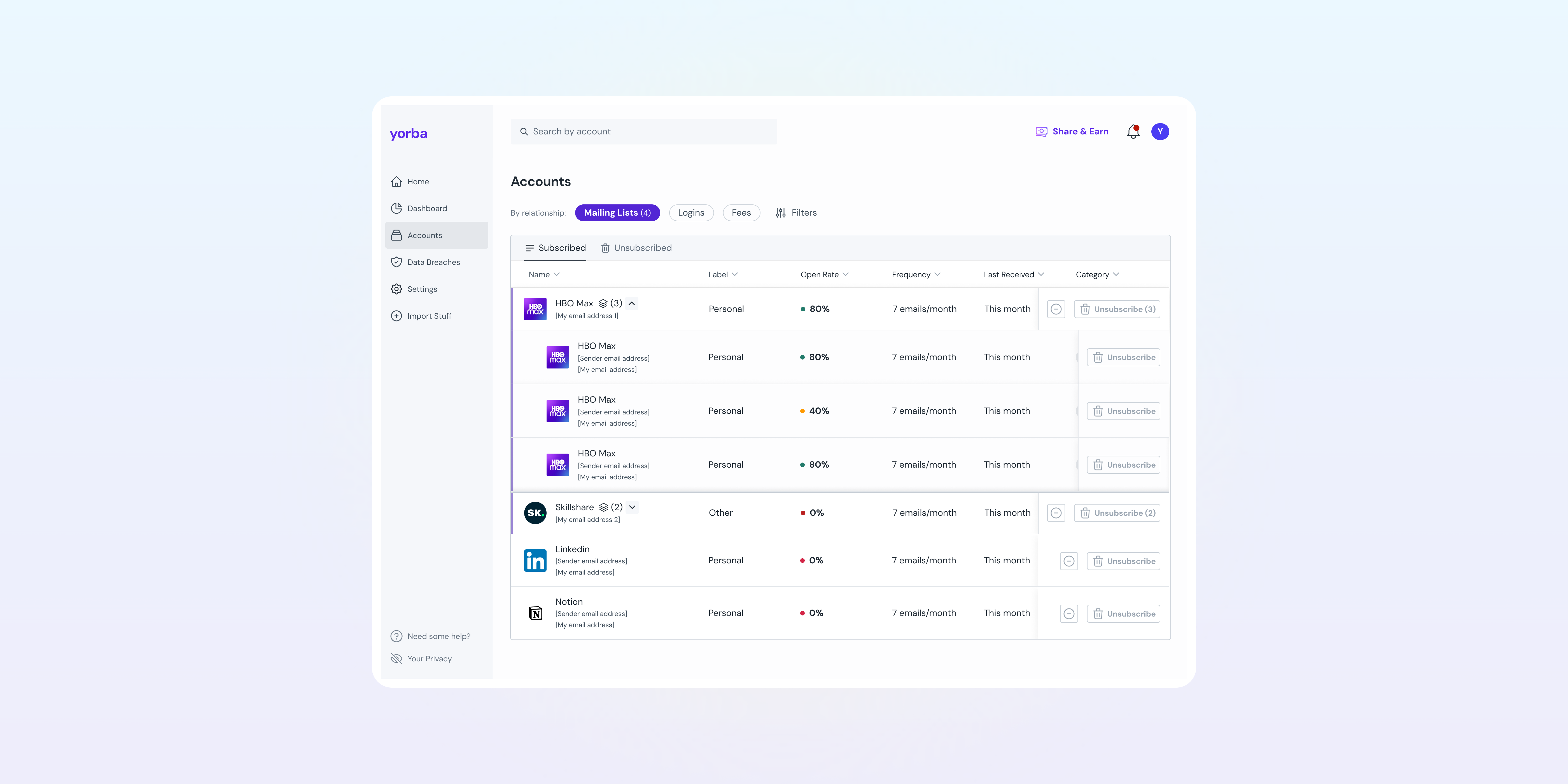
The Accounts page was a single table with a toggle switching between Mailing Lists, Logins, and Fees. Same page shell, same patterns, different columns per filter.
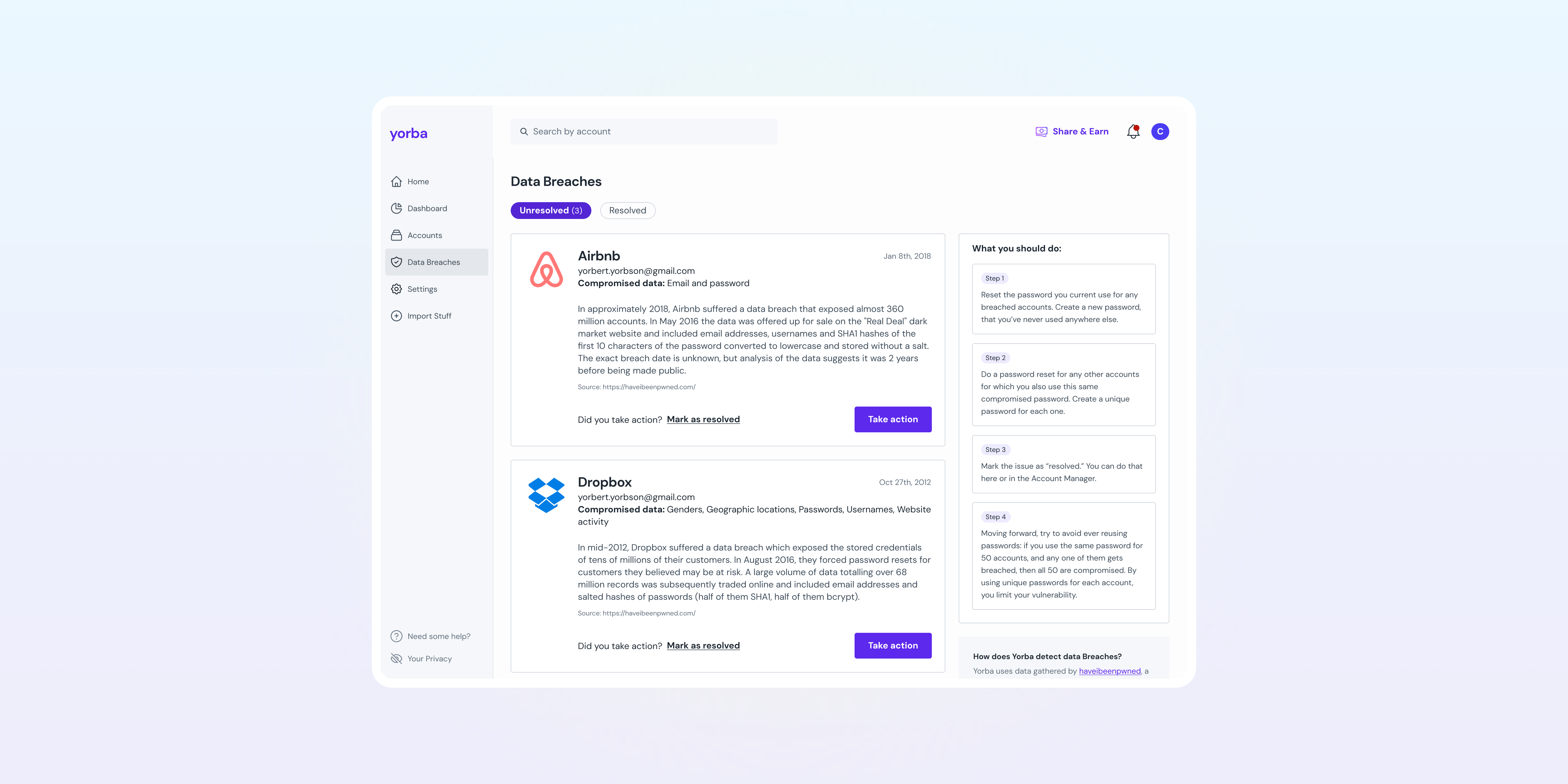
Breaches were not even in the room. They lived on a separate “Data security” page in a completely different format: long prose cards with a generic what-to-do sidebar, as if compromised accounts belonged to a different product.
The consequence was not superficial. Members could not tell what kind of relationship they were looking at, so they could not tell what an action would do. A question from testing captured it:
“I deleted my account with a company, so why am I still receiving newsletters from that company?”
One company can relate to you several ways at once (a login you delete, a mailing list you unsubscribe from), but with relationships reduced to filter states, the product never taught that model.
It showed up elsewhere too. The homepage suggested actions for mailing lists and nothing else, because mailing lists were the one relationship where acting paid off instantly: unsubscribing was automated, while the other types still relied on slower, manual work.
The pitch put the whole thing in one line: there has been a gap between what Yorba uncovers and the actions members take.
Two cycles, and nothing shipped until all of it was done
Two Shape Up cycles of about two weeks each, two relationships per cycle. The split was capacity, not strategy: the design decisions would have been the same either way. Which pair went first came down to technical readiness.
Nothing shipped until all the pieces were done, and that was deliberate. It meant waiting on more than the four pages: the per-relationship stats ran as their own Shape Ups, and the release held until those were ready too. The revamp changed the sidebar as well as the pages, so members needed to meet the new structure as one thing, not discover it in halves. The finished pages sat behind a feature flag while the rest were built, which also bought more time to test them before anything went live.
A known issue became a pressing one
The tables had always been handled differently underneath (different loading behaviour, different parameters), and the UI change was meant to bring them into line. Building the pages side by side made clear it had not: engineering had not yet made them behave the same, and now the inconsistency was visible in a way it had not been inside one filtered view.
So alongside the second cycle I introduced a shared loading pattern and a set of rules to pull the tables closer on the design side, while engineering found time to make them deterministically consistent underneath. Not part of the pitch, but the kind of thing that decides whether four pages feel like one product or four projects. The pattern outlived the project too: it was eventually adopted as the loading standard across the whole platform.
Four surfaces, one answer
The plan boundaries weren’t new. The trial, the scan depth on a basic plan, one connected inbox: those already applied across the product. What was new was four surfaces that all had to express them, and the risk was four different answers to the same question.
An empty table has more than one reason to be empty, and they are not interchangeable. No inbox connected yet. Nothing found. A scan still running. Results waiting for your review. A trial still available, or a trial that has expired. Each gets its own state, and where the member can do something about it, the action sits in the state: connect an inbox, review what was found. “We found nothing” and “you haven’t let us look” are different sentences, and only one of them is about the member.
That distinction is what makes a partial view honest. In a product about exposure, a table that looks populated when it isn’t is worse than one that says what it hasn’t looked at, because a member could reasonably conclude they have no subscriptions from an account that was never scanned.
It also decides where the upgrade prompt sits. The subscriptions trial runs thirty days and ends on a date, not when a table stops filling, so the prompt belongs to that moment rather than to an empty table that happens to coincide with it. What the scan found is held for a short window afterwards, so deciding late is not the same as losing it.
Same reason as the loading pattern above. Four pages, one product.
How I ran it
I led design across both cycles, co-shaping the pitches with our CDO. The rhythm was standups, refinement with engineering where I walked them through the flows, and work reviews that doubled as handoff. Handoff was mine to run, down to writing the Jira tickets myself.
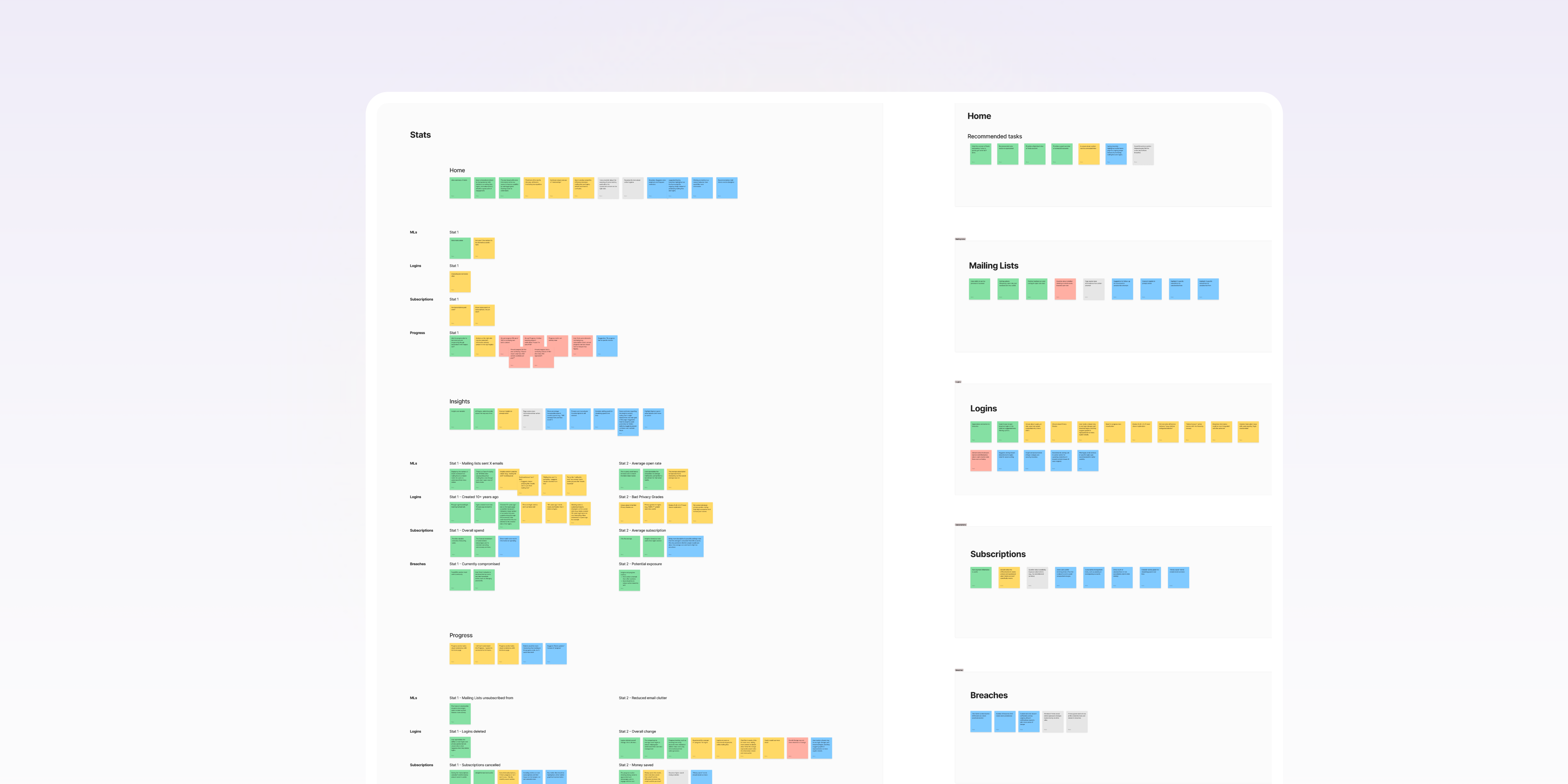
Two things were deliberately carved out to keep the appetite honest. The per-relationship stats ran as their own Shape Ups, roughly five weeks across two cycles, which is why the release waited on them. And the homepage’s recommendations and the data visualizations were designed and tested alongside this work but split into a later cycle of their own. The model came first; what it enabled came after.
Each relationship became its own destination
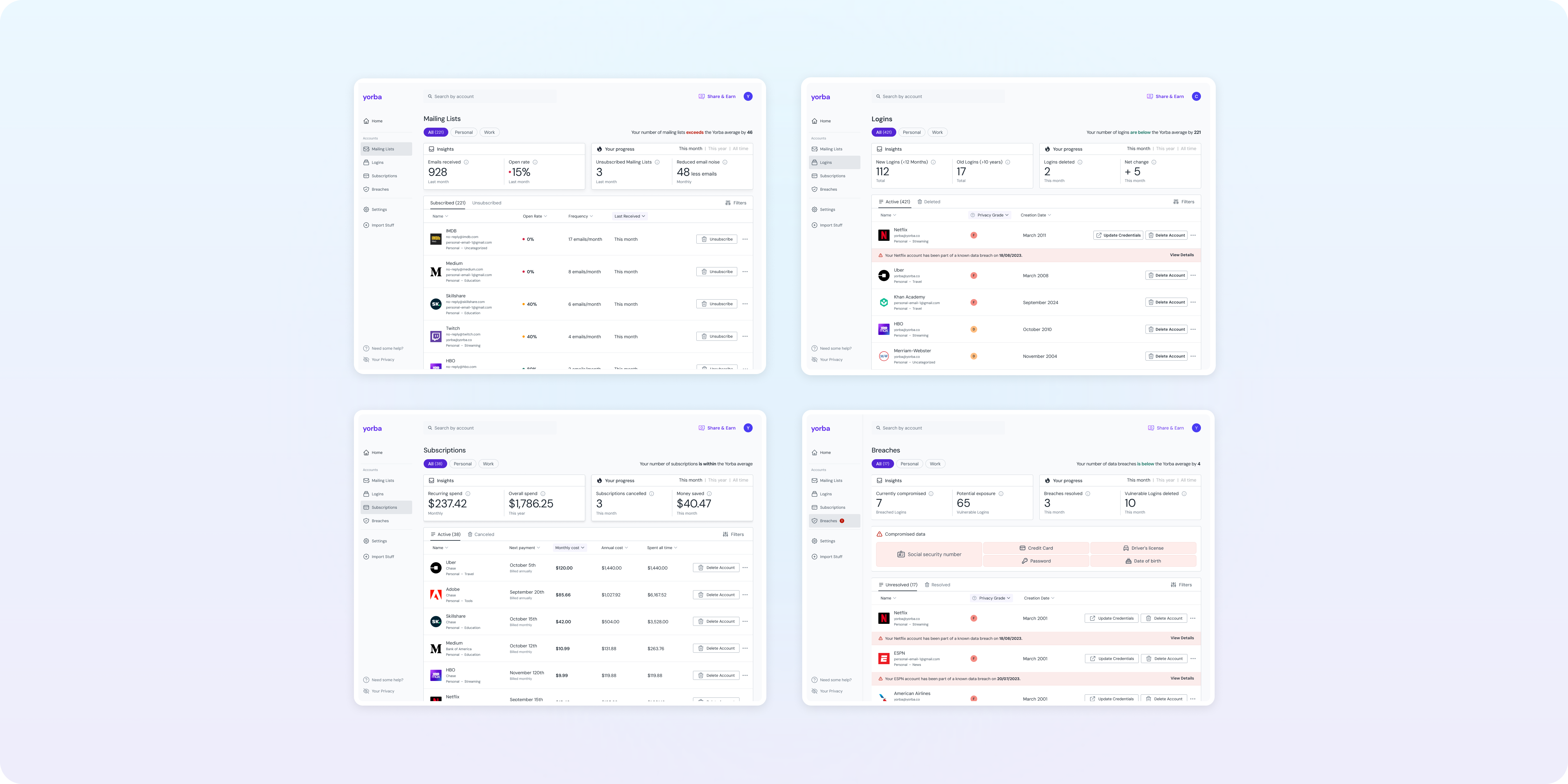
Four, because four was the number of distinct narratives the product had to tell. Each type leads somewhere different: a rarely-opened mailing list is a decision about noise, a decade-old login about exposure, a subscription about money, a breach about risk. Fewer categories would have blurred those stories together; more would have split them past the point of meaning anything. The unit was not the data type. It was the narrative that leads to an action.
The separation went deeper than layout.
Its own action vocabulary
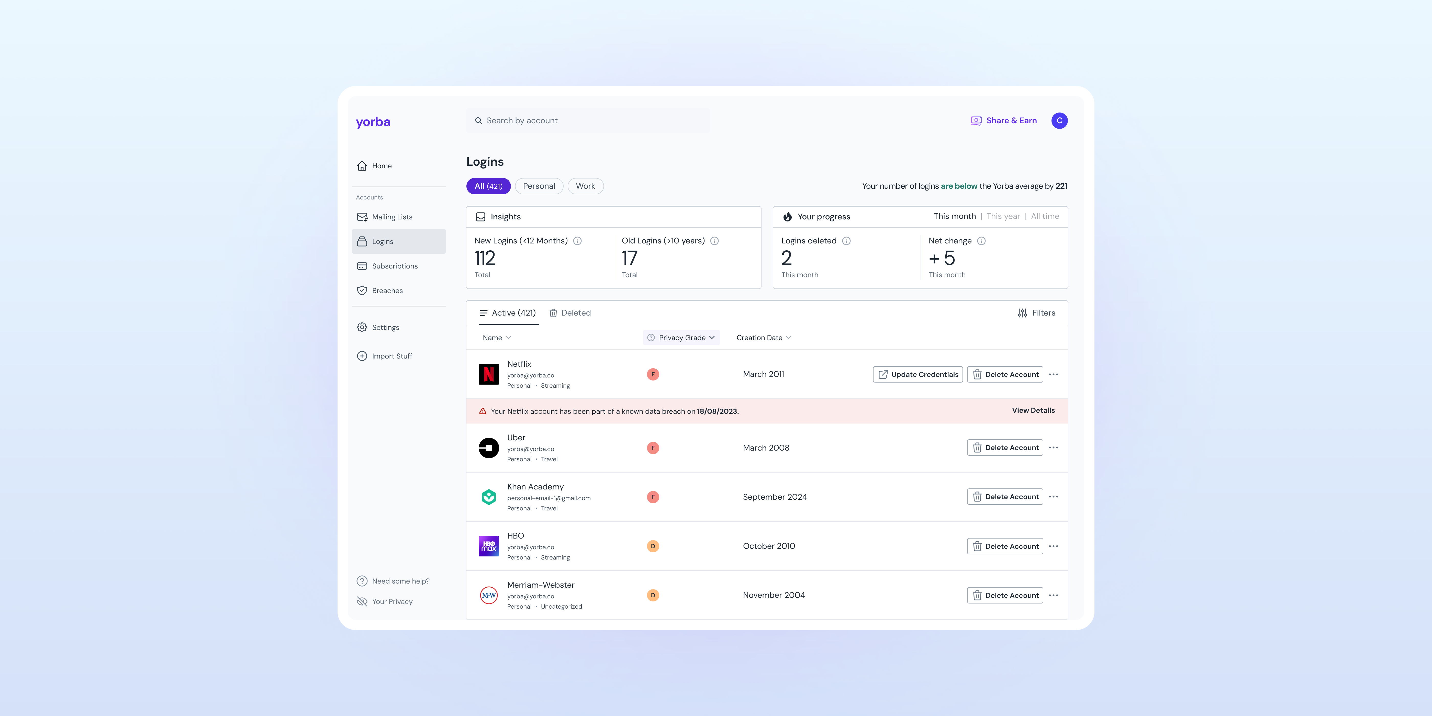
You unsubscribe from a mailing list, delete a login, cancel a subscription, update credentials on a breach. In the old table these were flattened into one generic row format, so the interface could not say what an action meant. Now it could, because it knew what it was acting on.
Its own data, pointed at a decision
Most of these tables already had their own columns; the work was reworking what they showed so each one built the case for that relationship’s action: open rate and frequency toward unsubscribe, account age and privacy grade toward delete, cost breakdowns toward cancel. Breaches got a genuinely new treatment, inline alerts with dates on the compromised accounts. And a clean line held between the general stats above the table and the per-company detail inside it, so the two never blurred.
Its own voice
Working with our copywriter, each page spoke in a register that fit its stakes, down to where a sentence put the agency. “You received X emails” frames the number around the member; “this company sent X emails” frames it around the company, and which you choose changes how it feels to read. The work went beyond tone: page voice, stats copy and tooltips, and standardising how key terms were used across the product, so “delete,” “cancel,” “unsubscribe” and the rest meant one consistent thing everywhere they appeared.
One company, several relationships
Netflix can be a login, a subscription, a mailing list and a breach all at once. We split it deliberately, showing the company separately on each page according to the relationship in question.
That is a duplication most information architectures would try to avoid. Here it was the point. The confusion we started from, why am I still getting their newsletters after I deleted my account?, comes from not knowing you hold more than one relationship with a company. Seeing Netflix on two pages, with two different actions attached, teaches that in a way no explanation would.
The split was not necessarily meant to be permanent; it was how you get people there. Once members understood the relationships were distinct, there was room to bring them back together, likely as a merged view per company: a single ledger of the actions taken across all of its relationships. Splitting first was what would make a combined view legible rather than confusing.
The one that did not fit
Three of these are relationships you have with a company: it emails you, you hold an account with it, you pay it. A breach is not a relationship. It is something that happened to one. Breaches are tied to the details held in a login account with a service, which makes them a state rather than a type.
We gave them their own destination anyway. A breach can be putting genuinely important details at risk, and burying that behind a filter on the Logins page would have understated it. The elevation was about care, not taxonomy.
What kept the model honest was sharing the pattern between the two. The breach alert that appears in a row on the Breaches table appears the same way in Logins, so a compromised account announces itself while you are looking at your logins, not only when you go looking for breaches. The two pages stay connected in the interface, even though one is a relationship and the other is a warning about it.
Two rounds, around 20 participants
Two rounds of interviews and usability testing, around 20 participants, with designs iterated between rounds. We tested whether the relationship model made sense to people at all, alongside the information architecture, the new stats, and the data visualizations. On the second round I worked with a junior product designer, who took on research and visual exploration, which let us cover more ground than a single designer could in a two-week cycle.
On the core question, it landed. Participants understood the four types without needing them explained, and the thing we had started from, the confusion about what an action would do, reversed cleanly. Before the change, actions were genuinely confusing; after, what an action was tested as unambiguous. The questions that remained were mechanical, about how a particular action worked under the hood, not conceptual. People no longer wondered whether deleting a login would stop the newsletters; they knew those were different things on different pages.
The four-type model itself was a strategic decision rather than a research finding. We took it into testing rather than out of it, and it tested positively enough to build on.
What got cut between rounds
Between rounds, the changes ran from copy to the stats themselves and what the columns showed. Two things also got held back. We dropped a progress visualization from the homepage that tried to show progress across all relationships at once. It conflicted with how people actually thought (a single notion of “progress” spanning four different kinds of account did not hold together in members’ heads), and it was built on a false premise: some accounts you keep on purpose, so there is always a gap between what you could act on and what you should, and a progress bar measured against a total can never honestly fill. It was also reaching into territory that belonged to a separate categorisation project we had not shaped yet. And we held off on quick filters in the tables, keeping the first release focused on the model itself rather than the ways of slicing it. Cutting both kept this work inside its own boundaries rather than quietly starting another.
The testing also reshaped detail inside the stats blocks. We cut a privacy-grade explainer we had built into the Logins insights after members showed little interest in the metric, putting a count of recently created accounts in its place alongside the older-accounts stat already there. On Breaches, we cut the progress stat so the block read cleaner. Those two were the ones breaking the pattern the other stats followed, and in both cases subtraction was what brought them back into line.
Two things followed that could not have happened without it
Each page could say something
With the types separated, every relationship could carry stats that meant something for it: emails received and open rate for mailing lists, account age and privacy grade for logins, recurring and overall spend for subscriptions, currently compromised and potential exposure for breaches. One dashboard had been trying to speak for four different things; now each spoke for itself. Progress stats came with time toggles and each relationship’s own idea of a win: fewer emails a month, fewer unused logins, money saved, breaches resolved.
The product could recommend across all four
The homepage’s suggested actions had only ever covered mailing lists. Once the four relationships had equal standing and measures of their own, the criteria could be written for each: mailing lists with low open rates and high frequency, logins created 10+ years ago with poor privacy grades, upcoming payments in the next 30 days, unresolved breaches. Every recommendation kept an “I want to keep this” escape hatch, so the product suggests and the member decides.
That’s the same rule as pending review on the tables: nothing joins a member’s accounts, and nothing happens to the ones already there, without them confirming it. The product proposes, the member disposes, on both surfaces.
The measures did not just describe the relationships. They became the parameters the product reasoned with.
You rarely open these emails. Still want emails from these mailing lists?
Old accounts. Poor privacy. Keep what matters, delete the rest.
These renew automatically. Still want to keep paying for them?
Be sure to update your credentials to these to protect your data.
Understanding first, then behaviour
Two numbers, measured before and after the revamp shipped:
They prove two different things. The first is understanding: contacts about actions not matching expectations, the “I deleted my account, why am I still getting newsletters” class of question, largely stopped happening. That is the clearest evidence the model taught people what it was built to teach. The second is behaviour: once members could tell what an action would do, they did more of it. Understanding leading to action, with an intuitive line between them: people act more readily when they know what the action means.
The release was gated, so this is a single before/after window rather than a controlled comparison. The new stats blocks went out at the same time, so the movement reflects the whole revamp and not the separation on its own. And the support number covers confusion-related contacts specifically, not total volume, which is the only reason a drop that size is plausible.
The right move was usually to take something out
The subtraction pattern was hard to miss. We were overhauling a lot of the product at once, and again and again the right move was to take something out rather than add to it.
The one I would push harder on is a pattern I caught in one place but not everywhere: framing progress as a count of actions done against a set of actions still to do. We identified it as a problem on the homepage and cut the cross-relationship progress view there. But each relationship kept a progress stat of its own, reshaped around what a win meant for that relationship, and the same done-against-remaining framing came with it. I think that framing carries a cost I under-weighted at the time.
For this kind of product, being told you have a list of things to deal with is not always welcome. Some people do not want a tool that greets them with a to-do list about their own digital life; they want a lighter touch, a suggestion rather than an obligation. Progress is better understood as evidence that their effort is paying off, not as a measure of what is left to do.
We did start down that path, and it was not mature enough to ship. The reasoning behind that direction, and what I would do differently, belongs with the visualisation work rather than here.
Two further cycles brought data visualization to each relationship page, building on the same measures. That work has its own case study: The Story Behind the Count.