Fixing the Funnel — +9.4% Conversion Uplift for ZooRoyal
Turning a leaky funnel into a cleaner buying experience
ZooRoyal (REWE Digital) had over a million monthly visits and a solid product catalogue. But the numbers weren't great — 4.98% conversion, 45% guest checkout abandonment, and more than half of orders coming from mobile without a mobile-first experience. A 4–10% uplift would mean €1.2M–€3M in extra annual revenue.
"How might we improve the buying experience of ZooRoyal?"
Two failure points dragging conversion down
The checkout funnel and the category pages were both losing users, but for different reasons.
- Discovery friction: opaque sorting, broken search, and overwhelming filters caused users to abandon before they even reached the cart
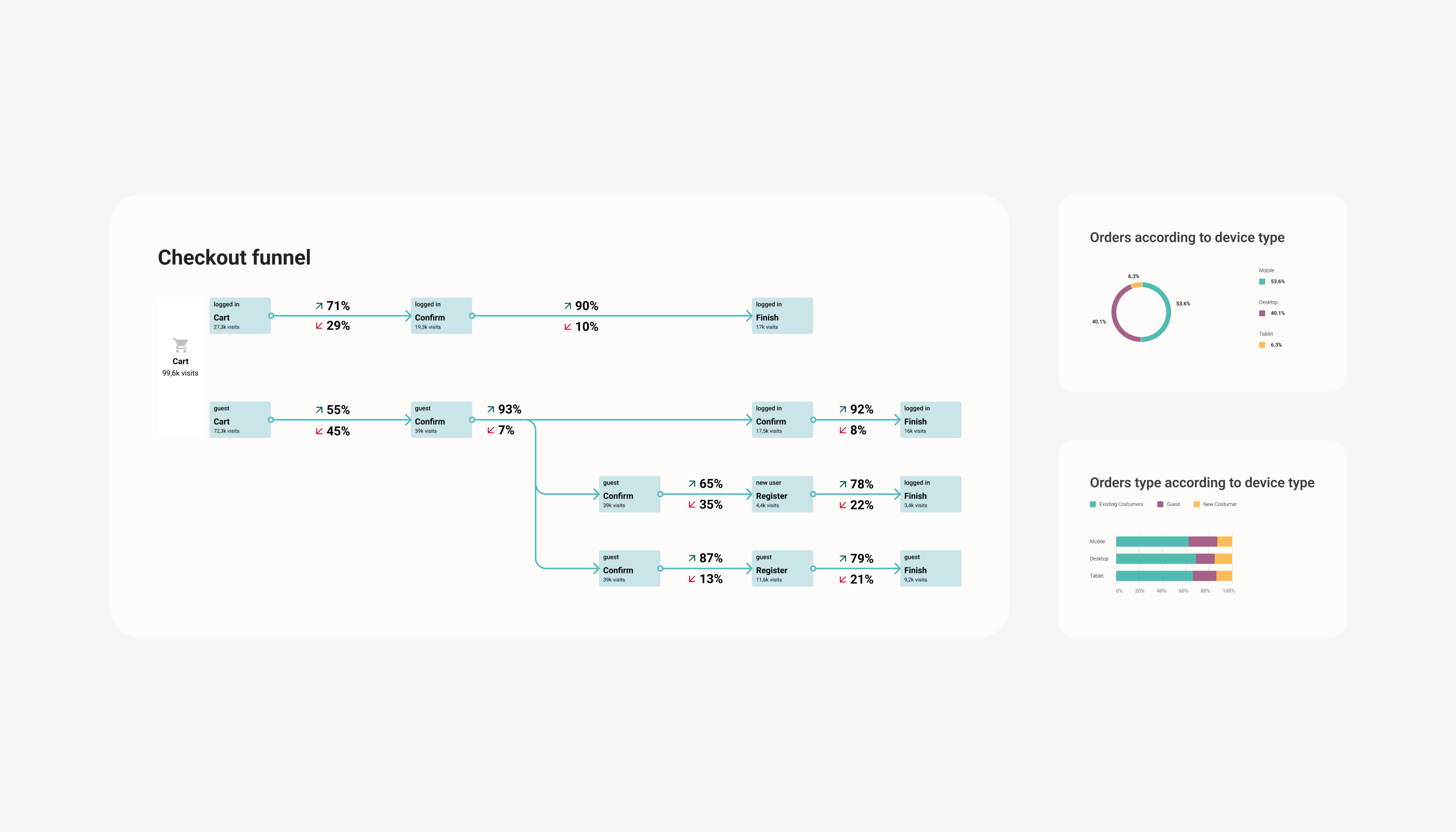
- Guest checkout abandonment: only 55% of guests progressed vs 71% logged-in. Error messages were missed in 20% of visits, and payment methods were unchangeable mid-flow
- Mobile was carrying the business — 65% of checkout visits came from mobile — without a mobile-first design
Existing research that shaped every decision
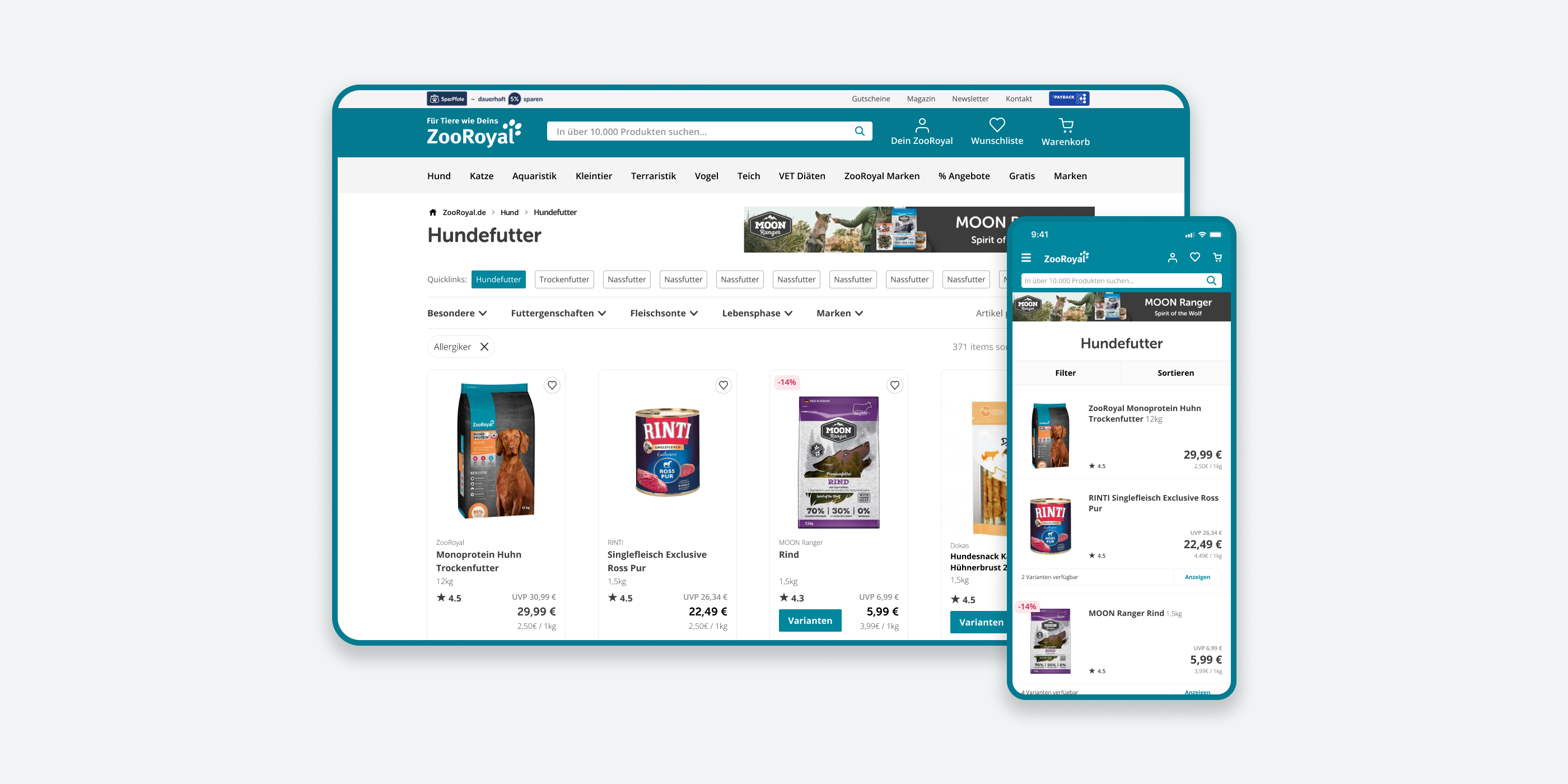
Filters were causing users to give up, not narrow down
A 2019 mobile usability lab test showed the problem clearly. Users went straight for the filters, but there were so many options that people gave up instead of narrowing down. Sorting felt random, so nobody trusted they were seeing the right products.
Guest checkout had a structural confidence problem
An August 2020 analytics deep-dive showed where checkout was breaking down. The biggest drop was between Cart and Confirm for guests. Error messages showed up in 20% of visits but were easy to miss. Once you picked a payment method you couldn't change it — that affected 53% of visits — and the Payback loyalty integration confused people more than it helped.
Mobile was carrying the business — but the experience hadn't caught up
Mobile trailed desktop by about 10% at the cart-to-confirm step, even though 65% of checkout visits came from mobile. The experience had never been designed mobile-first.
Usability testing validated direction before shipping
Five moderated sessions tested the filter interaction and cart/sign-in flow. Simpler filters reduced hesitation. The reworked cart flow gave people more confidence. We caught edge cases before development, which saved engineering time down the line.

Deliberate structure over disconnected redesigns
Setting direction
I started by working through the problem with the PM — reviewing existing research and Mouseflow/Google Analytics data together. The risk was ending up with two disconnected redesigns — one for the category page, one for checkout — with nothing tying them together. There was no Design System. The existing design had grown out of marketing and print assets, not product thinking.
Two instruments to provide shared structure
To keep things connected, we built two things. A style guide covering typography, colour, spacing, and component states. And three design principles:
- Emphasis — Make the most important action unmissable at every step
- White space — Reduce visual noise so users can focus
- Repetition — Use consistent patterns to build familiarity and trust
"Users weren't failing because the shop lacked features — they were failing because too much was competing for their attention at once."
Rethinking discovery on the category page
The category page had a hierarchy problem. Dense grids, filters eating up the mobile screen, and sorting controls nobody could find — everything competed for attention. We cut back the filter options, made active filters visible, and restructured the product grid. A full taxonomy overhaul was off the table because of live marketing campaigns, so we fixed what we could without disrupting promotions that were generating revenue.
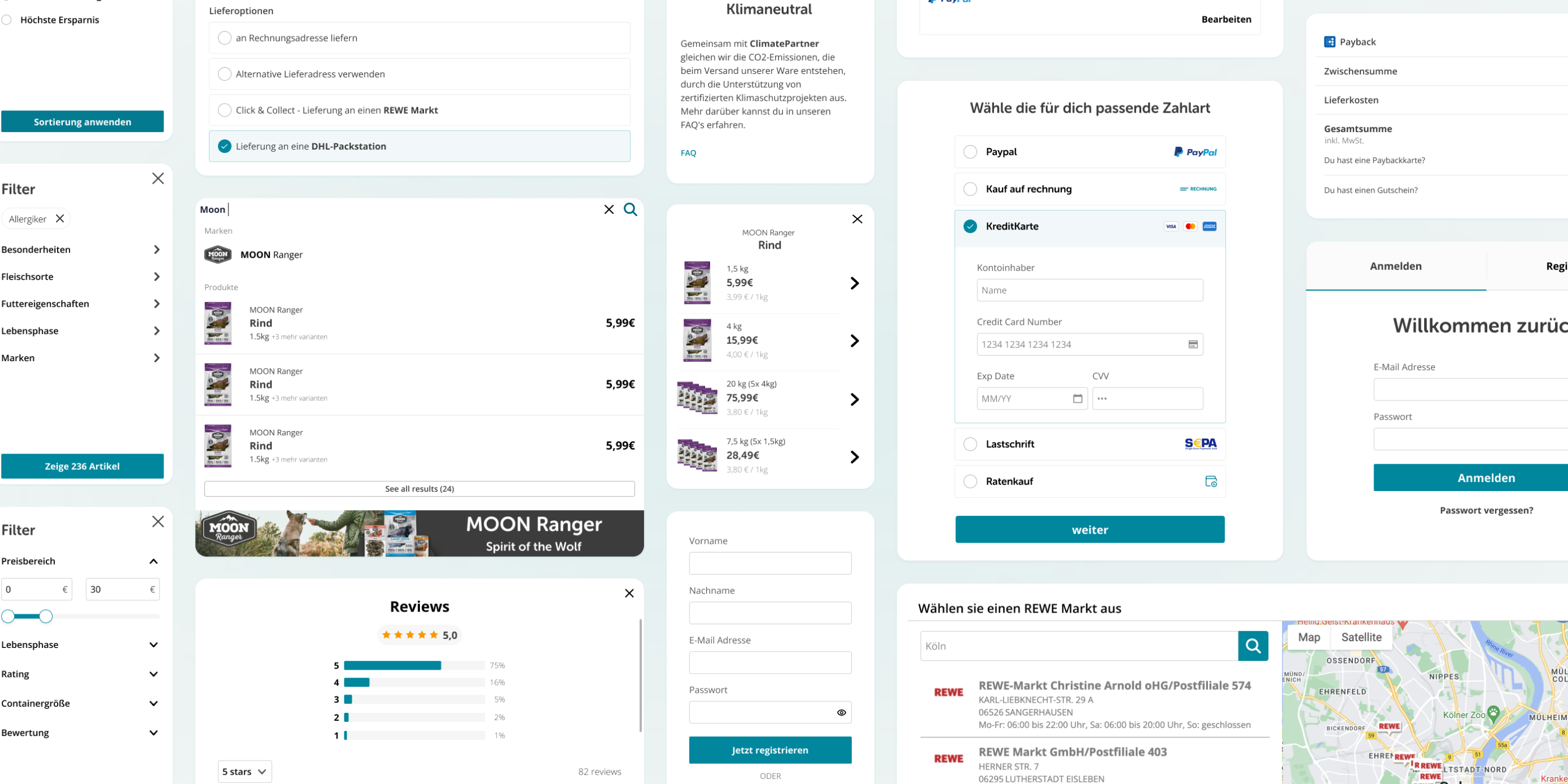
Fixing checkout friction point by point
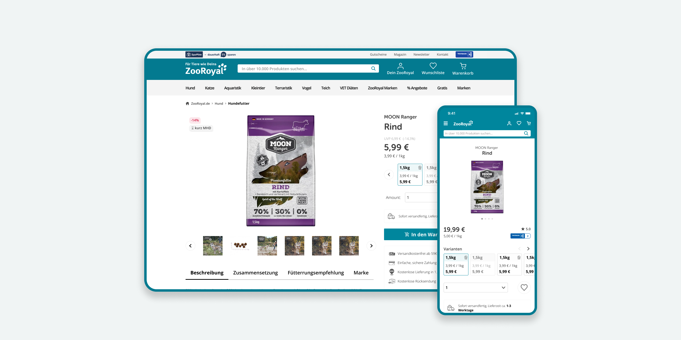
I added a micro-interaction between the product page and cart, made the price summary readable, and surfaced Payback points right at the decision moment. Payment was redesigned so you could see and change your method inline, with address auto-fill from PayPal or saved cards. Error states were rebuilt to be more accessible on mobile. The guest path became a real friction-free option. One constraint shaped everything: ZooRoyal ran on a website builder, not custom code. It took several redesign rounds to work within those limits.
Cleaner surfaces, confident decisions
Category page
A cleaner product grid with simplified filters and better sorting. Designed mobile-first, with white space and emphasis applied consistently. Users can scan faster and filter without feeling overwhelmed.
Checkout cart
The cart was redesigned around confidence: reassuring copy, a clear price breakdown, Payback points at the right moment, and payment methods you can actually see. The mobile form was built for one-handed use.
Checkout confirm & flow
Error states were made impossible to miss on mobile — larger, better positioned, colour-coded. Payment methods became editable inline with auto address fill from PayPal or saved cards. The sign-in overlay was simplified by removing steps that added friction without adding security.
All targets met or exceeded
The conversion uplift landed at the top end of the €1.2M–€3M business case. The guest checkout gap shrank from 16% to under 5%. Payment step drop-off fell by nearly a third.
"Given the delivery and the results so far, we'd like to extend the contract to cover more product areas — Homepage, Header, Search, Sign-up, Sign-in, and Wishlist."
Acting on what's already known
We were deliberate about scope, and the extended engagement proved it was the right call. The real lesson: when the research already exists, the hard part is actually acting on it. The 2019 lab test had named the filter problem. The 2020 analytics had flagged the guest checkout gap. The work was pulling those findings into one redesign — and choosing what not to fix, so what we shipped could be done properly.